
If you are a designer who works on a design system, the identity could be something that you have been struggling with. Many designers make design decisions by focusing on accessibility and functionality, because, in general, a design system is used for a large group of users and it also has to be scalable to many different products. You have to consider many aspects and design it focusing on user practicality and simplicity in mind.
My role in the Mineral design system was to create a unique icon set including a style guide. While defining the shape of an icon, I tried to design it with a more unique form by comparing them with other icons in other design systems in enterprise industry. Most of the icons required to be shaped in 16 and 24 pixel sizes, so I had to keep the style pretty minimal. We avoided the Line style and designed it as a Solid to avoid blurring or cracking when scaled in various sizes.
Here are the first version of icon sets I designed for the Mineral design system.

A first version of icon sets
When setting up this icon set on our navigation UI, it seemed too simple and looked incomplete. This icon set was more a good match for when simplicity, such as table UIs or drop down menus, was required.
To find better solution to design, we created all the possibilities of the SVG icons we could come up with. Below image shows the visual exploration with various icon styles.

A visual exploration with various icon styles.
The constraints we considered are as below.
Deliverable outcomes should be a SVG format.
They should be scalable from small (16 pixels) to large sizes (80+ pixels).
Be aesthetically pleasing when they change by theme colors.
The issues we wanted to cover from this icon redesign task are below:
Preferably use the icon sets for banners and supporting imageries.
Many of our icons had to include more than one meaning because of the complexity of the enterprise’s product features. Simplicity was mandatory but we could not just make everything too abstract or simple.
Most importantly, the icons should be able to stand alone and reflect the identity of the design system.
Here are the final icon design for the Mineral design system. We named as Multi-tone icon.

Icons for a navigation and system UI

Icons for a topology viewer
Key Features :
1. Grid System
We used a grid system from Material Icon Design. One of main reasons for using their grid system is that their grid template is well defined to have the perfect balance of icon shapes when applying a variety of key-lines. When the icons designed with these key-lines are applied side by side to the UI, all the icons appear as similar size.
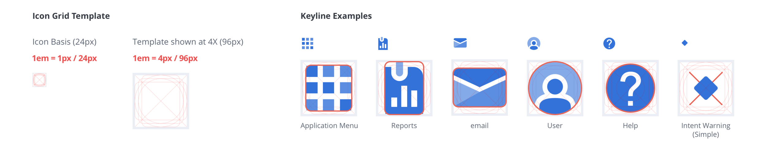
Grid System
2. Many details with Multi-tones
With the Multi-tone style icon, you can add many details up to 4 layers. This will help you to express perspective details and some information hierarchies. Many of enterprise products require an icon design with more than one meaning, so this Multi-tone icon style is a great solution to illustrate multiple symbols within an single icon.

Many details with Multi-tones
3. Scale
Because we added alpha values to each layer, when the icon is scaled it gives more sophisticated expression. Some of icons works great for the banner design or illustration, so it is reusable on other formats.

Scale
4. Adoption and Implementation
Because each layer has transparency, the icon reflects its background color and blends pretty well.

Icons in different color themes
5.Consistent
We used same forms for similar meanings.

Forms with consistency